AURORA - the rising sun in the east
In Chinese, the Iiteral translation for "AURORA"is "the rising sun from the east", which bears resenblance to the world's meaning in English (the dawn goddess); both symbolize light and hope and also embody life and spirit. For many years, the AURORA Group has strived to atain perfection in the development and manufacturing of products in furniture, OA and electronics 3D printer and office Cloud to maket products all over the world. We have defined AURORA as a Chinese brand name and we are committed to the creation of new opportunities and outstanding results.
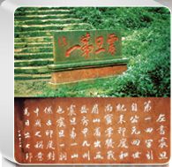
On Mount Ermei of Sichuan, a stone plaque with the inscription of "震旦第一" (The First AURORA) can be found. When Buddhism made its way east from India to China during the Eastern Han Dynasty, China was addressed as "AURORA" by ancient Indians. And thus, "震旦第一" has become the common goal that everyone at the AURORA Group is inspired to achieve. Inheriting such long running history, the AURORA Group exudes vibrant energy and momentum to move forward, just as the rising sun from the east as we strive to improve modern civilization.

The Smiling CIS Logo of AURORA
Aware of the value of branding to corporate management, the AURORA Group launched its corporate logo as early as 1970 and introduced its corporate identification system (CIS) in 1985. After years of business development and brand management, the AURORA Group's CI has once again evolved in 2012 – the Chinese characters of "震旦"will be the focus of the image, supplemented by the English word "AURORA" The font of the Chinese characters is now broader, more elegant and rounded. The upper portion of the character "震" resembles a smiling face and it represents the enthusiasm and joy that we show in our day to day work. The lower portion of the character symbolizes the steady strides we take as we move forward. With the smiling CIS logo, we aim to express the enthusiastic and friendly service attitude and quality that customers can expect at every AURORA retail store.

